This is an intermediate level tutorial that discusses one method of multi-column page layout. It assumes the reader has a good knowledge and understanding of HTML and CSS.
Introduction
Once upon a time, web developers used the HTML element <table> to layout content columns. This practice is now recognized as cumbersome and not very semantic.
These days, instead of using <table>, we use the <div> element as a container for content. Once you get the hang of it, using <div> becomes very liberating and greatly reduces the amount of markup needed to layout a page.
Basic Page Structure
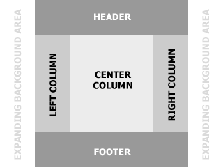
For this tutorial, we're targeting a layout that has three columns of content with spaces at the top and bottom for a header and footer. The page will be a fixed width and will also be centered in the browser's display area (Figure 1).
We'll begin with an XHTML page structure in its most simple form. In the <head> of our document, we'll point to an external CSS file.
<!DOCTYPE html PUBLIC "-//W3C//DTD XHTML 1.0 Transitional//EN" "http://www.w3.org/TR/xhtml1/DTD/xhtml1-transitional.dtd">
<html>
  <head>
    <title>My Website</title>
    <link rel="stylesheet" type="text/css" href="style.css" />
  </head>

  <body>
  </body>
</html>
Creating the Containers in the Markup
The first <div> we're going to create within the <body> of this page will contain the entire content area. This allows us to position our layout within the display area wherever we want. We'll give this, and all containers, a unique identity using the "id" attribute of the <div> element.
<body>
  <div id="page_container"></div>
</body>
Now, within our "page_container", we'll add containers for the specific content areas that we mentioned before. Again, we'll identify each uniquely.
<body>
  <div id="page_container">
    <div id="header"></div>
    <div id="left_column"></div>
    <div id="center_column"></div>
    <div id="right_column"></div>
    <div id="footer"></div>
  </div>
</body>
At this point, if we were to render this document, we would not be able to see anything. Let's add some dummy content so that we can see what's happening. We'll use a typical scheme for structuring information including titles, sub-titles, paragraphs and a menu.
<body>
<div id="page_container">
    <div id="header">
        <h1>My Web Site</h1>
    </div>
    <div id="left_column">
        <ul>
            <li><a href="#">Menu 1</a></li>
            <li><a href="#">Menu 2</a></li>
            <li><a href="#">Menu 3</a></li>
        </ul>
    </div>
    <div id="center_column">
        <h2>My Document</h2>
        <p>Vivamus elementum ligula gravida neque. Cras adipiscing ligula non turpis. Sed cursus scelerisque libero. Sed at arcu. Vestibulum metus. Class aptent taciti sociosqu ad litora torquent per conubia nostra, per inceptos hymenaeos. Phasellus id turpis. Sed purus. Integer eget ligula elementum felis aliquet rhoncus. Morbi augue.</p>
    </div>
    <div id="right_column">
        <h3>Sidebar</h3>
        <p>Vivamus non urna eget nisi placerat vehicula. Vivamus semper molestie lacus. Proin a tellus et massa placerat ultricies. Curabitur viverra convallis felis.</p>
    </div>
    <div id="footer">
        <p>Copyright Information</p>
    </div>
</div>
</body>
Our markup is now complete.
Adding Basic Styles
Let's create a basic set of selectors and definitions in our CSS file for the intrinsic HTML elements and for each of the containers. We want to remove the inherent margining and padding from all elements, remove the bullets from the <ul> that we're using for our menu, and allow for some simple background colors in our content areas for visual clarity.
/* Intrinsic HTML Elements */
body{margin:0;padding:0;}
div{margin:0;padding:0;}
h1{margin:0;padding:0;}
h2{margin:0;padding:0;}
h3{margin:0;padding:0;}
p{margin:0;padding:0;}
ul{margin:0;padding:0;}
li{list-style-type:none;}

/* Uniquely Identified Containers */
#page_container{}
#header{background:#999;}
#left_column{background:#CCC;}
#center_column{background:#ECECEC;}
#right_column{background:#CCC;}
#footer{background:#999;}
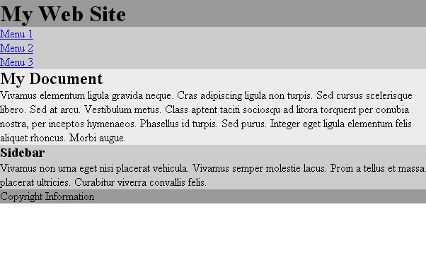
With the HTML and CSS in place, our page should render as shown in Figure 2. Notice that our document makes sense "semantically", similar to a document printed on paper. The web site has a title, there is a menu/table-of-contents for the site, the page we're viewing within the site has a title, and there is a clear heirarchy/structure for ancillary and tertiary information. The structure of this arrangement should always be based on the needs of the site and/or page that's being created.
Adding More Styles - Widths, Floats, and Clear
First, let's define a width and position for our layout by adding definitions to our #page_container selector in our CSS file. Again, nesting all the content in this overall container allows us a great deal of flexibility.
#page_container{width:760px;margin:0 auto;}
Now we get into the crux of creating a "float" scheme. For each <div> that we are going to use as a column, we'll add two definitions in our CSS, a width and a float.
Notice that the sum of the widths of these three elements is equal to the width of the #page_container element.
#left_column{width:180px;float:left;background:#CCC;}
#center_column{width:400px;float:left;background:#ECECEC;}
#right_column{width:180px;float:left;background:#CCC;}
When we added these definitions, we altered the postions and widths of the columnar elements in the render flow. To return to the normal render flow within the parent container, we'll need to "clear" the next element from the effects of the "float".
#footer{clear:both;background:#999;}
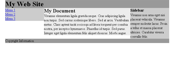
Our three columns now line up from left to right and the longest column, in this case the right_column, pushes the footer down the page, within the parent container (Figure 3).
That's it! That's how it works. This method will work in all current browsers and should render more or less identically.
Conclusion
Now that we've arranged a system of containers, we're free to start inserting data and fleshing out our styles. We might begin this process by adding some negative space around our textual elements. Because we're relying on a style sheet to define our visual presentation, we can easily achieve this effect by simplifying some of our definitions for intrinsic HTML elements while adding a bit of padding.
h1, h2, h3, p{margin:0;padding:10px;}
One of the first things we notice is that the columns are not all equal in length and therefore there are gaps below the shorter ones. In a real world application of this technique, this visual problem can be overcome easily.
Please PM me with any suggestions for improving this tutorial.
Thanks!
dM
This page was published on It was last revised on


