This is an intermediate level tutorial and is a continuation of a previous tutorial that can be found here. It assumes the reader has a good knowledge and understanding of HTML and CSS.
Introduction
In our previous tutorial, we saw how we can create multi-column layouts using semantic markup and CSS to manipulate containers. The methods we used required no workarounds, hacks or browser specific treatments. Here, we'll continue with that by examining how to overcome the technique's shortcomings and pitfalls without upsetting the layout.
Here are the markup and CSS that we were left with at the end of the previous tutorial.
<!DOCTYPE html PUBLIC "-//W3C//DTD XHTML 1.0 Transitional//EN" "http://www.w3.org/TR/xhtml1/DTD/xhtml1-transitional.dtd">
<html>
<head>
    <title>My Website</title>
    <link rel="stylesheet" type="text/css" href="style.css" />
</head>

<body>
<div id="page_container">
    <div id="header">
        <h1>My Web Site</h1>
    </div>
    <div id="left_column">
        <ul>
            <li><a href="#">Menu 1</a></li>
            <li><a href="#">Menu 2</a></li>
            <li><a href="#">Menu 3</a></li>
        </ul>
    </div>
    <div id="center_column">
        <h2>My Document</h2>
        <p>Vivamus elementum ligula gravida neque. Cras adipiscing ligula non turpis. Sed cursus scelerisque libero. Sed at arcu. Vestibulum metus. Class aptent taciti sociosqu ad litora torquent per conubia nostra, per inceptos hymenaeos. Phasellus id turpis. Sed purus. Integer eget ligula elementum felis aliquet rhoncus. Morbi augue.</p>
    </div>
    <div id="right_column">
        <h3>Sidebar</h3>
        <p>Vivamus non urna eget nisi placerat vehicula. Vivamus semper molestie lacus. Proin a tellus et massa placerat ultricies. Curabitur viverra convallis felis.</p>
    </div>
    <div id="footer">
        <p>Copyright Information</p>
    </div>
</div>
</body>
</html>
/* Intrinsic HTML Elements */
body{margin:0;padding:0;}
div{margin:0;padding:0;}
h1, h2, h3, p{margin:0;padding:10px;}
ul{margin:0;padding:0;}
li{list-style-type:none;padding:10px;}

/* Uniquely Identified Containers */
#page_container{width:760px;margin:0 auto;}
#header{background:#999;}
#left_column{width:180px;float:left;background:#CCC;}
#center_column{width:400px;float:left;background:#ECECEC;}
#right_column{width:180px;float:left;background:#CCC;}
#footer{clear:both;background:#999;}
Currently, our document should render almost identically in all *current browsers (Figure 1).
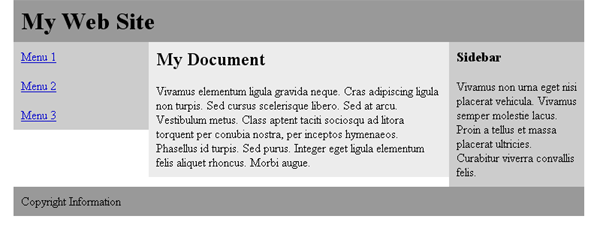
*By "current", I'm refering loosely to Internet Explorer 7, Firefox 2, Opera 9 and Safari 3. The current version of Konquorer should be added to this list, however, I do not have access to this browser.
Working with the Content-Box Box Model and Padding
The first thing we need to discuss and understand is the box model. Understanding this is important whenever we define a fixed pixel width for a block-level element. In this case, the <div> elements that we use for columns.
The are two types of box models, the "content-box" and the "border-box". The difference between them is how we regard their dimensions. Where the width of a border-box is measured form border to border, a content-box is measured in terms of the content area. This is illustrated below (Figures 2 and 3).
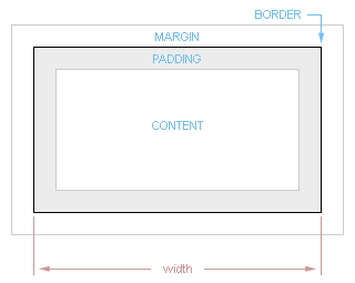
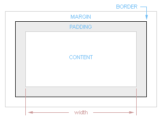
The box model most widely supported today is the content-box.
Because we've defined specific widths for the columns, we don't want to touch their padding or margining. Expanding these would, in effect, expand the cumulative width of the column and cause our columns to wrap. Therefore, we normalize these by setting them to "0".
To rephrase this idea; If I create a content-box and set it's width to 200 pixels, then added 10 pixels of padding on all sides, the box would render visually as 220 pixels.
While it may seem counter-intuitive, instead of apply padding once to the container, we apply it to the textual items within. Those elements haven't been given specific widths and, therefore, conform naturally to the container's content area. This was the last bit of CSS we added in the previous tutorial.
h1, h2, h3, p{margin:0;padding:10px;}
We could, of course, be more specific with the dimensions of our padding by specifying top, right, bottom and left dimensions. Let's do this, temporarily, with the <li> element using the shorthand notation.
li{list-style-type:none;padding:5px 10px 5px 10px;}
"How do I get all the columns to expand equally?"
The short answer is, "We don't." What we do, though, is create the illusion that this is occuring by using a graphical background. We don't apply the background to each column, individually. Instead, we apply a single background image to the parent container. In this case, the <div> identified as "page_conatiner". In Figure 4, we see what the resulting background will look like. To make this happen, we'll need to create, or obtain, a graphic that is 760 pixels wide and 1 pixel tall.

In the CSS, we can remove the solid colors we specified earlier for the columns.
#left_column{width:180px;float:left;}
#center_column{width:400px;float:left;}
#right_column{width:180px;float:left;}
Next, we'll apply our graphic which by default will repeat, or tile.
#page_container{width:760px;margin:0 auto;background:url(background.gif);}
When we render the page, it appears as though the columns expand vertically and equally, regardless of who much content we have in any given column.
Working With the <ul> as a Menu
The next thing we'll look at is the menu. The reasons for using unsorted lists as a menu and the advanced manipulation of them would be a good topic for a tutorial, however it is not in the scope of this one.
Modifying a <ul> used as a menu seems to be a stumbling block for many of us. Typically, the goal of styling the menu is to have each link stretch accross the horizontal width of the column. In addition, we'd like for the user's cursor to interact with the entire area as well.
The goal is achieved, simply, by instructing those links to render as block-level items, as opposed to inline-level items. We'll also reduce the padding of the <li> containers to "0" and instead add the desired padding the <a> elements. We'll be creating one new selector in our CSS.
li{list-style-type:none;padding:0;}
li a{display:block;background:#CCC;padding:5px 10px 5px 10px;}
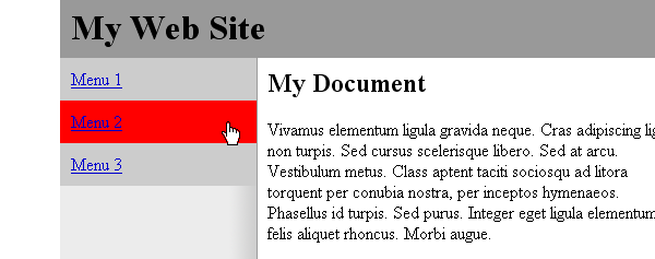
For the purpose of seeing the cursor interactions, we'll add yet another new selector, as well - a psuedo-state of the <a> element.
li a:hover{background:#F00;}
Conclusion
In this tutorial we've seen how to construct and maintain a three column layout using semantic markup and CSS - without workarounds. In addition, we've explored how to overcome common errors that would, otherwise, break our layout.
While this tutorial did not address it, the same technique can be applied to percentage based layouts.
Please PM me with any suggestions for improving this tutorial.
Thanks!
dM
This page was published on It was last revised on


