Introduction
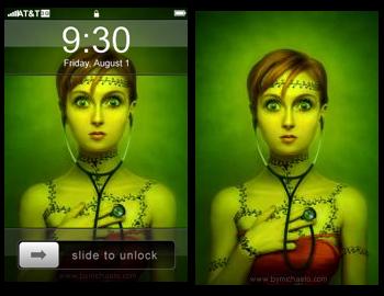
I recently implemented a feature on an iPhone wallpaper site that makes it possible for visitors to see a wallpaper both by itself, and then when their mouse hovers over the thumbnail, view it with the overlay that an iPhone generally displays over the background.
Rather than have two thumbnail images -- one for the normal view and another for the overlay view -- I decided to keep the existing thumbnail images and just use a 32-bit PNG overlay with semi-transparency. Doing it this way means I don't end up using twice as much disk space for thumbnails, don't have to make twice as many HTTP requests for thumbnail images, and don't have to generate all-new thumbnail images to use like CSS sprites.
There is one issue with this method, it will require CSS hacks for PNG transparency to work properly in IE6. Since those hacks are outside the scope of this tutorial, I'll leave it up to you to implement them if you require IE6 support. Chances are that if you need them, you're already going to have the hacks implemented for another feature already anyways. 🙂
My Requirements
When I set out to make this work I wanted a few things.
- Keep the semantic meaning of the
<a>and<img>elements already in place - Falls back to a normal thumbnail linked to a full-size image behavior gracefully
- No Javascript required, CSS only
I wanted to keep the semantic meaning of the <a> and <img> elements so search engines know what the things are.
The reason I wanted to use CSS instead of JS didn't have anything to do with graceful degradation of the effect if that's what you're thinking. It had everything to do with simplicity, it's just easier to do it with CSS than it would be with JS since there's no animation involved.
HTML and CSS
The HTML was fairly simple. I only needed to add a class and style attribute to my <a> element, and wrap the <img> in a <span>. Since I'm using an XHTML-transitional DOCTYPE the align attribute is valid on an <img> and is used in my case to pull the alignment of the next element up level with the top of the <img>.
<a class="iphone-overlay" style="background-image:url('{thumbnail}');" href="{wallpaper}" title="{title}">
    <span>
        <img src="{thumbnail}" alt="{alt}" width="{width}" height="{height}" align="left" />
    </span>
</a>
The CSS is fairly simple as well.
a.iphone-overlay * {margin:0; padding:0;}
a.iphone-overlay, a.iphone-overlay span {display:block; float:left;}
a.iphone-overlay span {background-image:url("iphone-overlay.png"); visibility:hidden;}
a.iphone-overlay:hover span {visibility:visible;}
a.iphone-overlay img {visibility:hidden;}
How it works
The <a> and <span> elements are given a block display so that they can be assigned a background image. The <img> element is given width, height, and uses visibility instead of display so that the parent elements (<a>, <span>) do not collapse around it.
When all goes well, the <img> element functions like a piece of glass that holds a pair of rubber bands open.
By default, both the <span> and <img> element have visibility of hidden so that the background for the <a> element, which happens to be pointing to the same image the <img> element points to, will show through what is essentially functioning like two pieces of glass.
Here is a visualization of how things stack up.
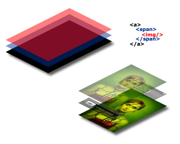
When everything is supported the <img> element is always hidden and simply functions like a piece of glass all the time. If for some reason there is no CSS support, the <img> element just displays the image instead of letting the <a> background show through. Since they're the same image, it looks the same either way.
When the mouse hovers over the link, the visibility of the <span> element which uses the iPhone overlay as a background is made visible. Since the overlay is a semi-transparent PNG it allows the wallpaper image to show through like it would on an iPhone.
Conclusion
There's probably a hundred ways to achieve this effect, but for me this has been the easiest to implement on an existing site.
This page was published on It was last revised on